Map 1: Consumers
Making levels for a game older than me!
6/10/20
Download (requires DOOM II to play)
My start in Doom mapping came from an interesting assignment prompt in my Experimental Games course:
Using an existing game as a base, create “game art” that makes a statement about the games industry.
It can be a mod, something created in a game’s level editor, etc. as long as you build some sort of experience from an existing game.
At first I was stumped. We’d learned in class about the concept of “game art”, artistic experiences created using games as a toolset for communicating some message. Kind of like photobashing but with video games. Our professor showed us some more artsy, less gamey examples that removed all obstacles from Super Mario Bros. Then we saw two examples that really grabbed me: a DOOM WAD set in an art museum where you shoot snobby prominent art critics, and an abstract Wolfenstein 3D mod that replaced all textures/sprites with disorienting black/white pixelation.
That week I’d been reading about the binary-space-partitioning method used by John Carmack to render 3D environments in DOOM. I was interested in the architectural limitations imposed by the game engine, and how level designers overcame them with creative solutions. This seemed like a wonderful opportunity to shoehorn my personal interests into another assignment make something interesting in an unconventional medium!
Here’s a gameplay video. Make sure to watch in 1080p; YouTube is currently throttling video quality (because COVID-19), so you have to set it manually.
Short and sweet.
In case it isn’t clear, the statement made here is that gamers can be a toxic bunch with little respect for the people making the games they love. Finding a successful career in game development is already a herculean task, so it doesn’t help when you face strong opposition from your consumers. While it may (or may not) be a small vocal minority that nets the reputation, it’s tough to keep that in mind when you’re being sent slur-laden death threats because you chose one store over another.
As for the development process, it took quite some time to figure out what I was doing here. I started working in SLADE, a DOOM editor with support for macOS and Windows, and followed this wonderful tutorial written by a blogger named Eevee. It took several days to get comfortable with the tools, but I’m very proud of what I put together! Thanks Eevee!
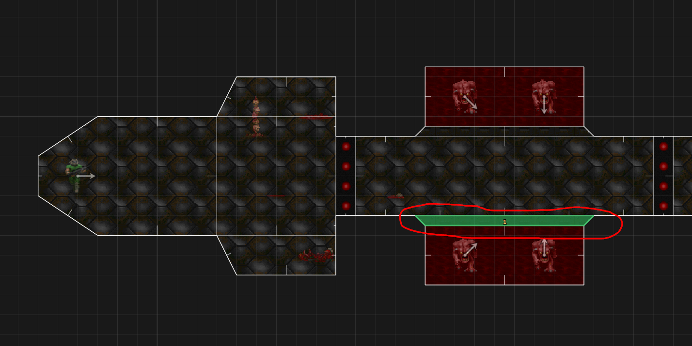
The level architecture in DOOM is constructed as a collection of “sectors”, which are made up of “linedefs”, which are connected by vertices. Basically, you can draw these flat sectors and mess with their heights to form whatever you want.


The keyword here is flat: everything in (vanilla) DOOM is flat! The engine doesn’t support slopes, so you’ll have to settle for stairs or an elevator instead.
Most of the assets used in my maps are borrowed from the DOOM II WAD itself (WADs are what you store the game data on); because of that, you’ll need a copy of DOOM2.WAD to play my maps, as they need to be loaded together. However, I did make a few custom textures for this level:

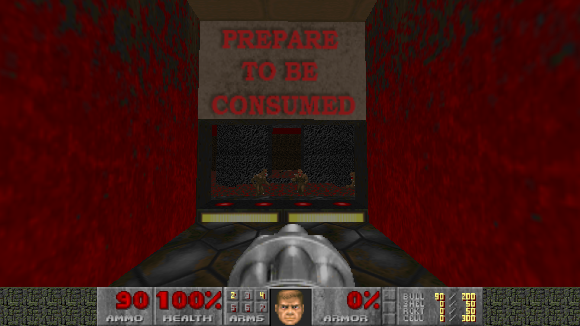
The grungy banner messages in the hallway were created as simple 128x64 textures (actual size below). Every pixel counts here!

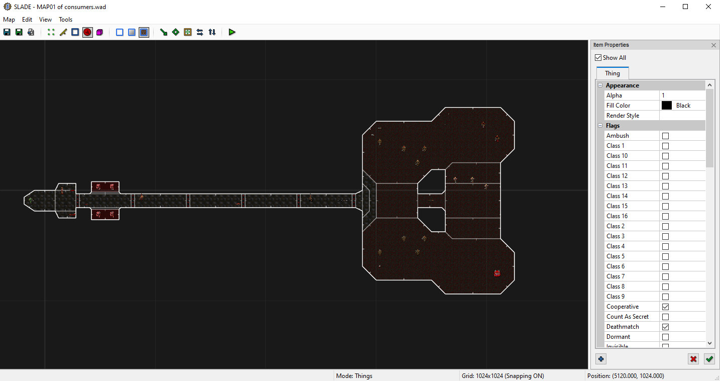
This was a simple level for me to experiment with, and I had fun learning to work with the engine. Also, by sheer coincidence the map layout ended up looking like a sweet guitar!

For my next map, I built upon what I’d learned here to create a more intricate, complex map. Click below to check it out!