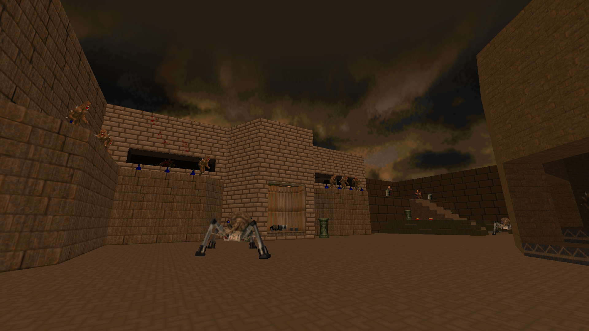
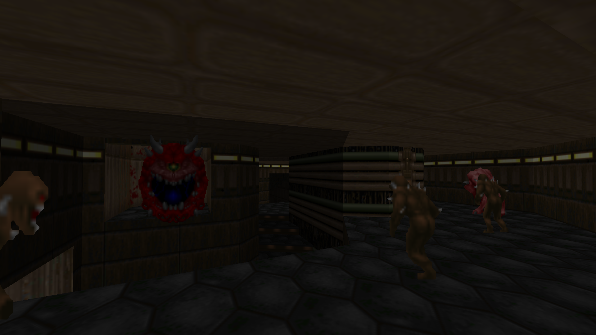
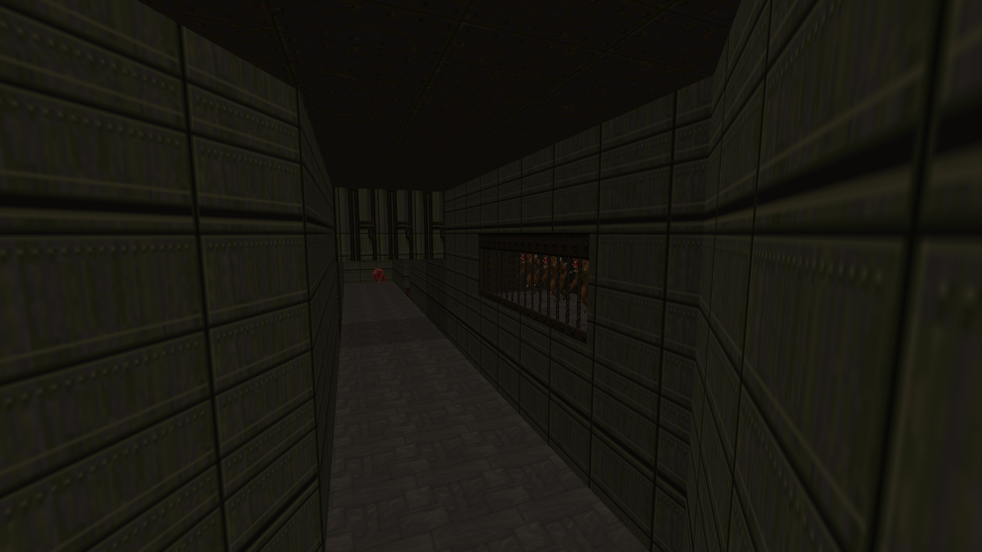
Map 2: Complex
Making levels for a game older than me!
6/10/20
Download (requires DOOM II to play)
For my next map, I wanted to make something more expansive and intricate, a traditional map rather than an artistic statement.
I ended up spending much, much more time on this map than I anticipated. I started working on the map in early February, and 6 months (and a global catastrophe) later I’m finally calling it complete! This is just one of several attempts to write this development blog: after weeks of polish, I’d write about the process and take screenshots of the map before finding something I could improve upon, and the cycle would continue.
Here’s a playthrough of the level:
The Mentality
As COVID-19 wreaked Hell on Earth, I found comfort creating my own Hell in DOOM. I spent hours and hours, and my parents grew concerned about my caffiene-fueled level design benders.
The obsession stemmed in part from my interest in the archaic game engine and the experimental alchemy of level design. But above all, I found an escape in DOOM’s chaotic atmostphere. Watching the world burn made me grow angry. America shit the bed in its response to the pandemic, and obscene police brutality grows vanilla as the economy takes another historic downturn, forming yet another parallel to Nazi Germany. Our social consciousness has, in a nationalist fever dream, forgotten that we are operating concentration camps on American soil.
Anyway, happy good thoughts. Let’s talk about the map!
The Process
Before doing anything, I had to learn from the best. So I spent some time replaying the original DOOM games, taking a closer look at how id Software designed their levels.
After blasting through DOOM I and II, I took John Romero’s rules of level design to heart, most notably the following:
- Conscious use of contrast everywhere in a level between light and dark areas, cramped and open areas
- Making sure that if a player could see outside that they should be able to somehow get there
- Being strict about designing several secret areas on every level
- Making my levels flow so the player will revisit areas several times so they will better understand the 3D space of the level
- Creating easily recognizable landmarks in several places for easier navigation
The rule that resonated most for me was contrast: I wanted to create a more varied map, combining large open spaces with claustrophobic, dark corridors. And, of course, I had to take advantage of DOOM’s technical feat: vertical architecture.
When I’m making things, I often fall into the trap of perfecting the prototype. So I made an effort to avoid this, carving out the map in big rough chunks: make geometry first, ask questions later. It was like an architectural version of that game you’d play in art class as a kid: draw a big scribbly line on your paper, then try and make it into a coherent picture.
While this granted quick iteration, the tradeoff was a map lacking a clear identity. Where is it set? What is the theme? Even the map’s name was an afterthought. My haphazard development cycle left no time to answer these questions, but I’m happy with the final result regardless.
Through frequent iteration, I gained a better understanding of the engine’s limitations and how to work around them. I’d take breaks to play community megawads, like Back to Saturn X or Resurgence. While ripping and tearing through the countless levels, I picked up on the mappers’ tricks and techniques to create an immersive space.
Polish Time
Looking back on my progress, I can see a trail of gradual improvement from room to room. I tried to remedy this by making frequent polish passes on older sections of the map, but at some point you have to be happy with your work and move on. The nice thing about using source control for level design projects is you can walk back in time to see how much has changed. So let’s see some level design glow-ups!

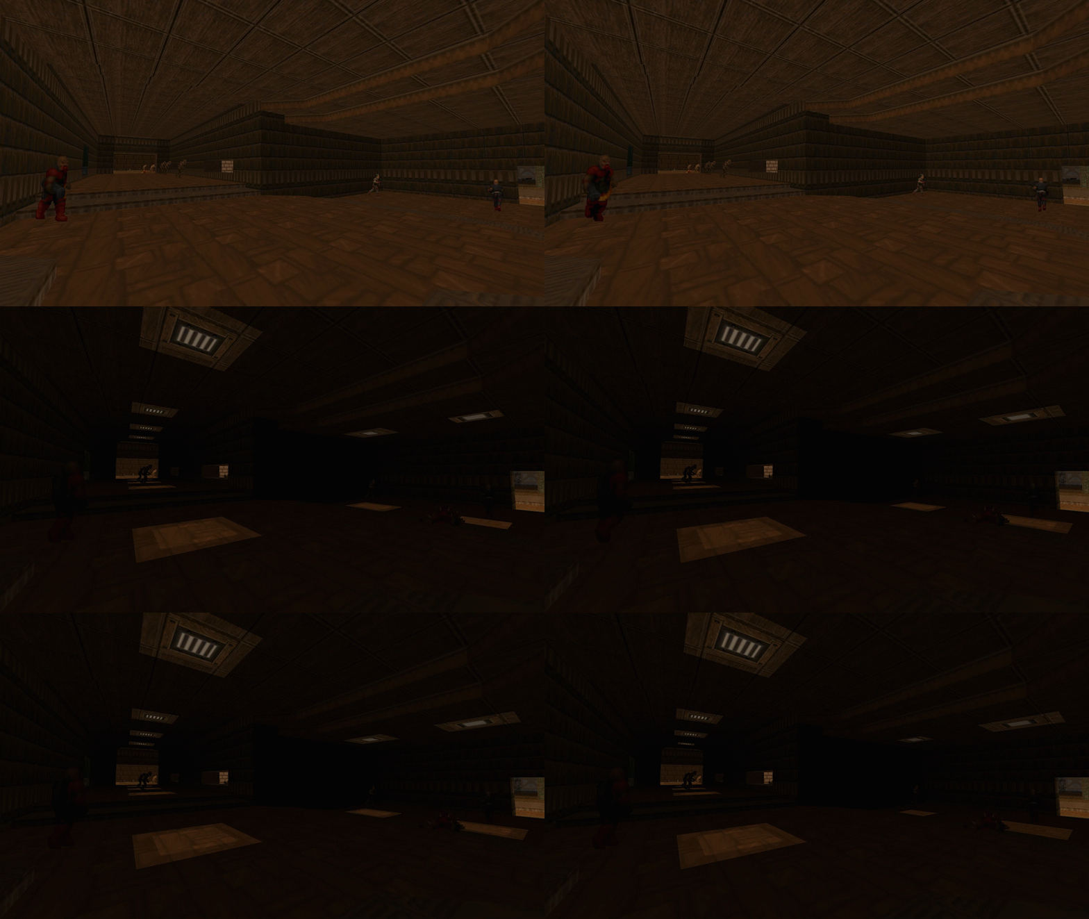
I wasn’t happy with this hallway, so I added some dramatic flickering lights to make it more interesting.
If I learned anything from Hideo Kojima’s approach to games, it’s that hiding information can make gameplay more exciting.
This prison area was looking a bit boring, so I carved out a concrete beveling and added some props to make it more shapely.
It could still use some work, but I don’t want to crawl deeper down the rabbit hole.
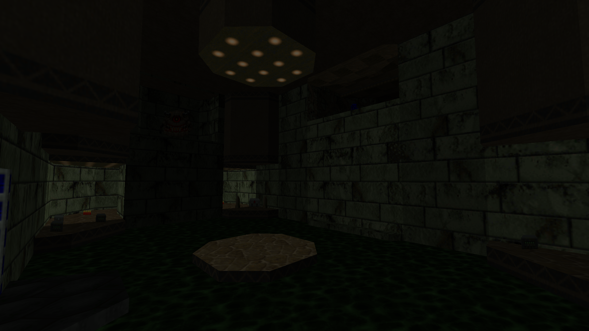
Remember that acid chamber from earlier? I got a lot of feedback from playtesters that the map was too dark in places, so I brightened this room up a bit. Other touches helped bring the area together, like the pipes pumping acid into the room and the green glow it casts on the room.
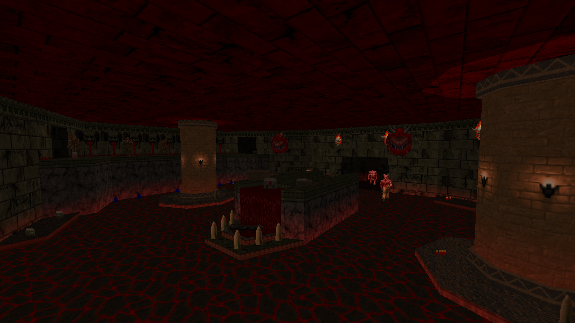
This temple arena looks like a whole new place! I wanted this room to really feel like Hell, so I went for a striking red color scheme, widened the space, and added a blood fountain to the front.
I’m very proud of this room. It looks like it could fit right into the original games!
That’s all folks
There’s plenty more map to cover, but I won’t make you sift through it all here. Check out the gameplay video above, or download it for yourself if you have a copy of DOOM II.
