The GameCube controller's button layout is kinda sick
Just hear me out!
12/4/24
I was up late at night (12:14 AM), looking in the not-very-targeted Recommended sidebar of Youtube after watching a video, and I saw this thumbnail:

I didn’t click the video, but I did stop to think about it myself… The layout is distinctly different from the standard + shaped layout in which we find our face buttons on modern controllers:
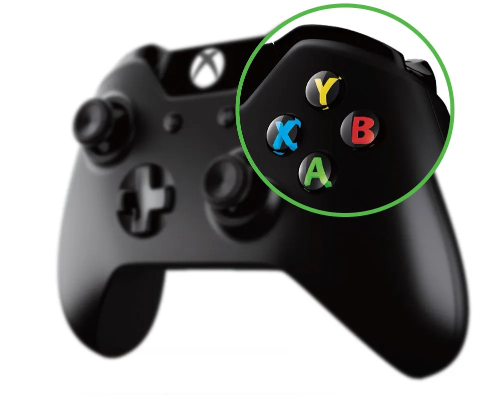
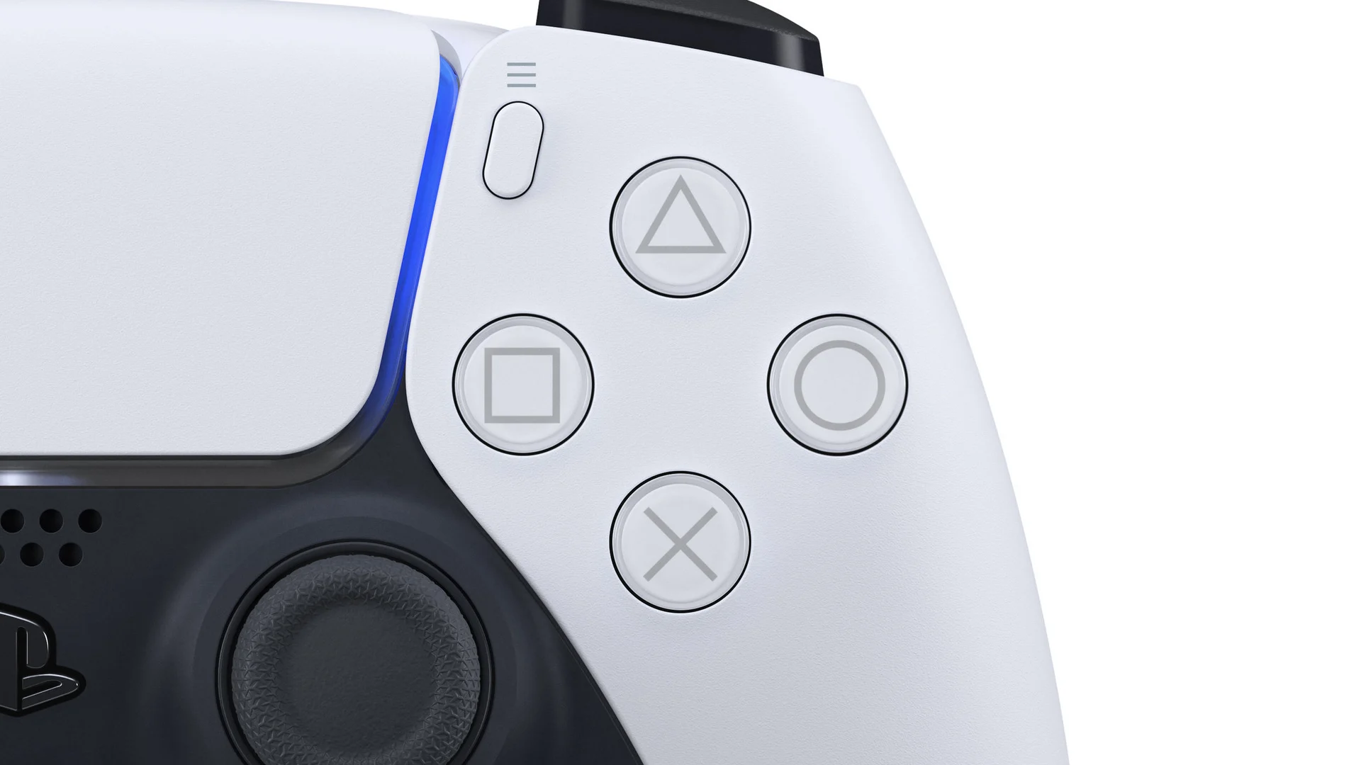
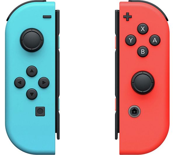
Now here’s a closer look at the GameCube controller’s face buttons, with some example controls overlaid (it seems to be Crazy Taxi?):
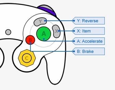
Notice how the big circular A and B buttons are bound to consistent active-verbs, “go forward” and “stop” (you are using these all the time in a racing game). Then you have the funky bean-shaped X and Y buttons bound to more contextual actions, “use item” and “reverse” (you use these sometimes, but not nearly as often). The size and shape of the buttons provide them a clear hierarchy of importance (listed from highest to lowest):
- A
- B
- X/Y
A designer can easily assign input bindings based on their priority:
- (A: Go Forward)
- (B: Stop)
- (X: Go Forward) (Y: Reverse)
Acceleration and braking make up much of your movement kit, the backbone of a racing game. You wanna go forward real fast in a racing game so that gets the top priority (A). When you’re rounding a turn or on a collision course you might want to brake, so that gets the next priority down (B). X and Y are handed the less common actions, and hey look at that you have an intuitive input scheme!
If you never felt like you had to look down and read the button labels, it’s because your brain isn’t really processing their labels as much as distinguishing them via their natural shape language. Since A is the highest priority button, it belongs in the middle of the others and should be the biggest and most attractive one to rest your thumb on. Other buttons are just a short hop away. It’s brilliant and I don’t know why we strayed from the path.
I’ve found that one of the most mind bending puzzles of game design is binding inputs for a gamepad. Keyboards provide an ocean of keys to slap stuff on, but most modern gamepads only have:
- 2 thumbsticks (axes almost universally used for movement/camera control)
- 10 face buttons (2 triggers, 2 bumpers, 4 face buttons, Start + Select/Back/Options*)
- 2 click buttons on the thumbsticks
- 1 D-pad (provides 4 input buttons)
* Nobody can figure out what to name this thing!
So about 16 buttons. Some games have way more verbs than that! You have to get creative with context-sensitive inputs like buttons the player can reconfigure to a large selection of tools/abilties, or “modes” that toggle different behaviors for buttons. Supporting input on a gamepad is a whole endeavor that is largely unappreciated and taken for granted!
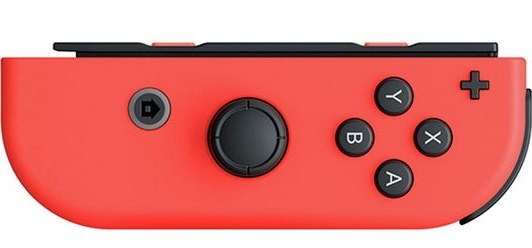
This looks weird, man! I hope they revisit this shape language in their next system’s controller.